I love writing on Medium. It’s been my go-to blogging platform since February 2021, and I couldn’t be happier with my progress.
But I tend to forget the other side. I am also a passionate reader. I’ve been paying for the Medium membership ever since I joined 2.5 years ago. And I had the pleasure of reading and getting to know some amazing writers.
Medium is a great platform for reading. The recent update to the page layout (back to the roots, so to speak) with a more minimal story page layout without a sidebar and other distractions has brought back focus on reading.
Thanks for this, Medium!
I have two little things that I’d love to see Medium change for the reading experience though. The first was just removed with the design update. We need that one back. The second is a more substantial upgrade.
Let’s get into those in detail!
1. Claps & comments
With the new design, Medium has removed the floating bar, fixed at the bottom of the screen when scrolling through a story. That bar displayed the claps and comments icons.
This was a very handy feature. It was a reminder to clap and comment on the story you read. It also showed the number of existing claps and comments which I’m always interested in.
Now you only see claps and comments at the top of the page and at the end of the story. It’s okay, but I believe we are losing engagement because of this. And I am not the only one thinking that. Fellow writer Circé Creates tweeted about the decrease in claps recently.
And I agree. This small design change has an impact on claps and comments. I noticed it as a reader myself. You miss clapping or commenting simply because the icons are not shown at all times.
Bring that one back, Medium! It helps readers & writers.
2. Best & trending
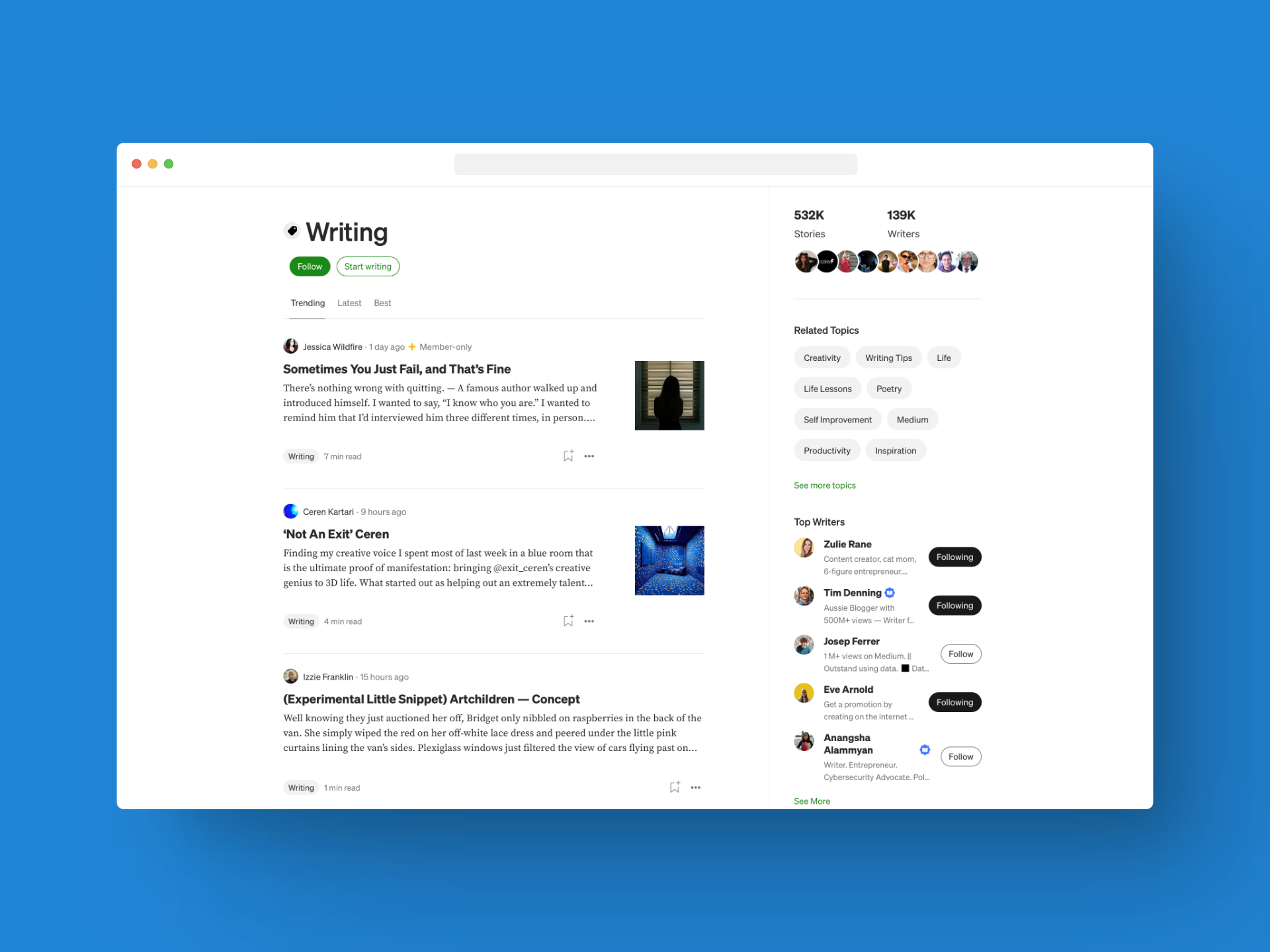
If you’re familiar with Medium, you should know the Topics pages. For each topic (or tag), Medium has its own landing page. See an example for the topic “Writing” below.

This topic landing page shows quite a few helpful details, like trending articles, the latest stories on this topic, and the bestselections, all three with filters for time frames like this year, this month, or all time.
On the right-hand side, we find related topics, numbers of stories and authors, as well as the top writers for the topic.
This is great. You can find some useful information here.
I don’t want to talk about this section, however. What I wanted to illustrate, is the top left tab design with “Trending, Latest, Best”.
We need these three sections on every author’s profile, in my opinion.
Let’s imagine the following: I read a recommended story by a new author I didn’t know before. I love it. Logically, I visit their profile next.
What I’d love to see there, is an easy way to find their best stories (based on views, reads, or reading time, whatever Medium fancies), as well as their trending articles (the ones that are currently doing well), and the newest articles.
Just like on the topics pages.
Many of us writers pin an “About us” post on our profiles that includes our best and favorite stories. A tab section would automate this process.
It would also showcase the latest work, the current favorites, and what the Medium algorithm deems the “best” stories for each writer. I want to know this! I bet many readers want that too.
How about you?
The bottom line
Yes, Medium is great. People will always nag and complain, but it’s hard to find a better blogging platform.
As a reader, Medium provides a streamlined experience with few distractions, no ads, banners, pop-ups, and such. That is a huge deal.
With these two little improvements, Medium could further improve the reading experience while giving the writers some helpful features as well.
What would you add?


